A couple of new labels

Homebrew Talk - Beer, Wine, Mead, & Cider Brewing Discussion Forum

Help Support Homebrew Talk - Beer, Wine, Mead, & Cider Brewing Discussion Forum:

This site may earn a commission from merchant affiliate links, including eBay, Amazon, and others.

Fman

Member
Joined
Apr 5, 2009
Messages
14
Reaction score
1
What do you think?

The first one is a Dogfish 60 minute clone from Sam's book.
The second one is a Hefe-Weisen with lots of lemon and orange.

Bottom Fed Brewery.jpg


Citrus Summer Flounder.jpg
 
I like the lables and like where your going with your theme. If I could change one thing I would put a stroke or outline around the catfish and flounder images. I think it would look great.
 
Nice. I wonder how it would look without the white rectangle around the fish images? Or add a border like mentioned previously.
 
Well Catfish Butt is already bottled so nothing I can do about it. I'll give a shot at removing the white around it. I'm not that great with Photoshop and my 16 year olds not here. I might just wait for him to get home.

I have a 9% IIPA label I'm working on as well. I'll post it later.
 
Took out the white and put in a drop shadow on them...I dunno about the hammered head, but the other ones turned out pretty well.

3504677627_1972b93156.jpg


3505525528_b219f794e2.jpg


3504716347_807e42a9fe.jpg
 
These are really nice. The single theme works really well. For the hammerhead, since the red background is dark, how about a white drop shadow? But they all look great the way they are regardless.
 
Here it is with a white drop shadow...not much of a difference, but a bit of an improvement...good call on the white drop riromero

3505353285_78db9ec5ed.jpg
 
I have to do something with the hammerhead, it looks cheesy. I think it needs to be bigger.
What you did to the flounder is awesome.

Can I send all of my labels to you?
 
Nope they're your labels I was just doin what I could to help. PM me if you have any other labels that need the same treatment.
 
After further review, what the Hell's up with his tongue?
 
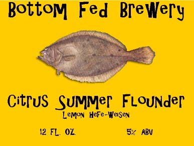
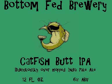
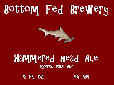
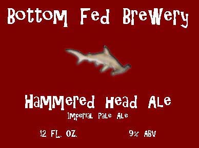
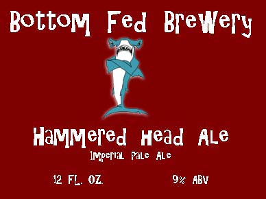
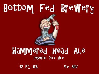
One last piece of advice. Bring up the 12 fl. oz & abv to the same line as the imperial pale ale line. Then move all the bottom text down toward the bottom, take the top brewery text off of the top edge (down about 1/8"). Then enlarge the central image... VOILA! Just my $.02. Otherwise I think they look good.

Schlante,
Phillip
 
I think it's a constant work in progress.
I'm thinking of changing the brewery name to Bottom Fed Brewers.
What cha think?
 

Latest posts

Back
Top