2nd attempt at 1st label

Homebrew Talk - Beer, Wine, Mead, & Cider Brewing Discussion Forum

Help Support Homebrew Talk - Beer, Wine, Mead, & Cider Brewing Discussion Forum:

This site may earn a commission from merchant affiliate links, including eBay, Amazon, and others.

riored4v

Well-Known Member
Joined
Jan 17, 2008
Messages
1,307
Reaction score
9
Location
Aurora
First one is below and wasn't to happy with how it turned out.

logo700.jpg


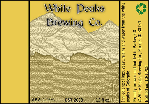
Here's the newest one which I'm really liking. Only thing I wish that I could possibly figure out is how to either make the mountains/snow a bit whiter or if I should incorporate a design in the middle of the label for the corresponding beer. Also, sorry for the clarity, it turned grainy when i saved it as a jpeg for some reason.

Thoughts?

centennial2623.jpg
 
The new one is much, much better. I agree that adding white to the mountains would be cool. It would also help the brewery name stand out more. Are you using Photoshop?
 
Thanks.

If anyone has advice on how to make the upper portions of the mtns whiter, please let me know.

I'm a complete newb to both programs, but i've been using Photoshop and Illustrator.
 
I used the selection tool to create the outline for the white peaks section. Then I created a new layer over yours (pasted into a new document from copying your image) and filled it white a solid white. Then dropped the opacity to 55%.

whitepeakspr3.jpg


You will be able to get a better result since you have the original files. Also, it would have been a lot of work for me to do it behind the text but I'm assuming your text is on a different layer so it should be cake.

Edit: For the graininess, if you're saving it via Photoshop I would just check the quality (1-12) to make sure its pretty high. If you're saving via mspaint it'll always be grainy.
 
ok, thanks for the info.

yea, the text is on a different layer, so i'll try doing what you mentioned and add some white.
 
Better, Rio.

What about the writing at the bottom? It's kind of hard to make out. Maybe enlarge and bold the font.
 
Better, Rio.

What about the writing at the bottom? It's kind of hard to make out. Maybe enlarge and bold the font.


Yea. it's seem thin but when i print it out it shows up pretty good. It seems when it gets saved a jpeg, the font gets thinned out.
 
Word. Cool Rio. You'll have to send me a bottle or two once you get the label affixed so as I can see first hand.:mug:
 
Might be able to manage that.. especially since it IS being brewed out of one your old kegs..lol
 
Back
Top