Terrible Brew Co.

Homebrew Talk - Beer, Wine, Mead, & Cider Brewing Discussion Forum

Help Support Homebrew Talk - Beer, Wine, Mead, & Cider Brewing Discussion Forum:

This site may earn a commission from merchant affiliate links, including eBay, Amazon, and others.

IvanTheTerrible

Well-Known Member
Joined
Nov 6, 2007
Messages
123
Reaction score
1
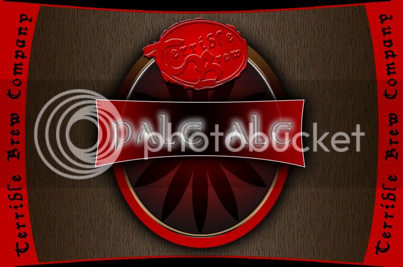
In anticipation of my brewing this weekend, I created my label today. What do you guys think?
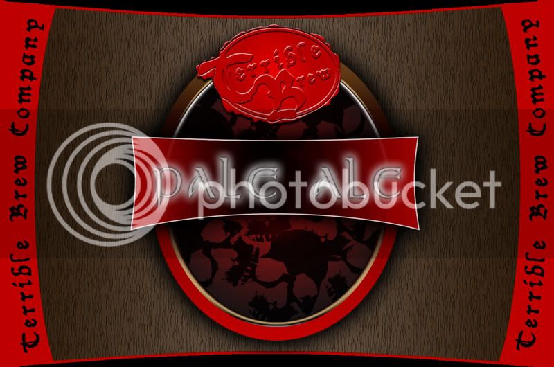
NOTE: I REMOVED THE BACKGROUND THAT LOOKED LIKE A WEED LEAF AND REPLACED IT WITH "TERRIBLE SKULLS"...I THINK IT WORKS...

tbcopy5.jpg
 
Try putting a dark stroke around the Pale Ale. It will help the text pop out from the outer glow. The Terrible Brew logo is great. I really like the wax seal effect. Reminnicent of Jose Cuervo.
 
I agree, a great label, but the 'pale ale' kinda gets lost in the glow... and maybe rotate the 'Terrible Brew Company' on the right border 180 degrees (bottom of text inward)...
 
Looks great!

I wish I had the skills to do some of these fancier labels. I feel there's a weakness in my "geekitude" because of my lack of p-shop talent. It must have been all the electronics and networking training, rather than web design and graphics, that I did.
 
The first thing that came to mind when I saw this was, "Why are there pot leaves in the background?"

Otherwise, it's very striking and eye-catching, and I like it.
 
CplHunter said:
The first thing that came to mind when I saw this was, "Why are there pot leaves in the background?"

Otherwise, it's very striking and eye-catching, and I like it.


LOL...they werent meant to be pot leaves...but you arent the first person to say that! Clearly, your minds are in the gutter! :D
 
the wax seal RULES!!

maybe we could get a little tutorial or hint on how to make one like it?
 
Using Illustrator, I created the text, the oval, and the squiggly shape as 3 different objects.

I brought them into photoshop as seperate layers.

So using the 3 objects I created 3 layers...

1. The oval with the outer outline (not the squiggly) and the text knocked out with a Bevel/Emboss - Inner - Smooth - Down.

2. Below that is the squiggly layer which has a Bevel/Emboss - Smooth - Up.

3. Below that is the gradient oval that gives the background the shimmer.

It took me a while to get it right, and had to use trial and error in trying to figure out what should be negative/positive, but in a nutshell, thats it.
 
looks awesome -

one thing. You see where the A and E is? Can you eliminate some of the white line leaking from the lower layer? Make the pale ale square not as translucent?

Thats my suggestion but your label is badass
 
Back
Top