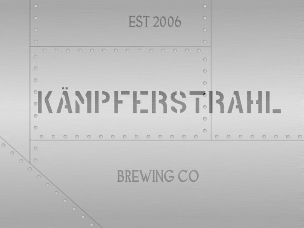
Kämpferstrahl Brewing Logo Design

Homebrew Talk - Beer, Wine, Mead, & Cider Brewing Discussion Forum

Help Support Homebrew Talk - Beer, Wine, Mead, & Cider Brewing Discussion Forum:

This site may earn a commission from merchant affiliate links, including eBay, Amazon, and others.
Joined
Jul 24, 2006
Messages
14,260
Reaction score
786
Location
Southwest
Here's my new logo (well...at least my new logo in progress):
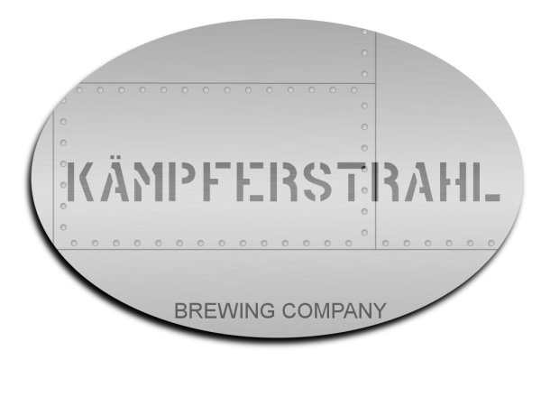
KSbrewing.jpg


Translated literally, Kämpferstrahl is "fighter jet."

Comments?
 
I like it! The simplicity works for me, and I would wear a t-shirt with that logo.

The only thing I would change (and it's a minor one) is to maybe change the font on the "Brewing company" at the bottom? Maybe something other than Arial? :)
 
Perhaps a gothic German font.

You could also put splashed beer mugs painted on the side for keg kills. :D
 
Ok, here's a little bit more refined version:

4688-KSbrewingoval.jpg


And here's the entire panel without the oval mask:

4688-KSbrewingbig.jpg


EdWort - I tried a few German fonts like you suggested, but it didn't flow very well. The curly lettering (even on the simplest of fonts) was distracting when the rest of the design is so straight-lined.

I'm pretty happy with it, but I'm open to suggestion, of course!
 
A couple suggestions:

First, I'd stick with one font if possible. Make the "est 2006" and "brewing co" in the same font as Kampferstrahl.

Second, I'd make "est 2006" and "brewing co" curved to match the curve of the adjacent oval. I think that'd rock.
 
If you are going for the side of a plane look, maybe some simple markings , like little bombs to coralate with ABV or something. But as far as just a brewery logo I think it looks good.

Cheers
 
i like it...the kamperstrahl lettering doesn't quite look "stamped" tho. i think cuz it overlaps the panels a little bit. just not as realistic as it could be IMO, but it's minor...looks great anyway
 
Brainstorming here:
This is not a step - what aircraft is complete without it.
A little weathering around the rivets and panel.
The diagonal element should be the ovaled version if at all possible. The diagonal really tells me aircraft and not ship hull (follow me?).
 
olllllo said:
This is not a step - what aircraft is complete without it.
A little weathering around the rivets and panel.
The diagonal element should be the ovaled version if at all possible. The diagonal really tells me aircraft and not ship hull (follow me?).
"THIS IS NOT A STEP" - if I can incorporate it without it being distracting, I like it!
The diagonal - yup, totally follow you - I'll see what I can do!
Weathering - great idea, and one I was contemplating. I just need to figure out how to do it!

Thanks for all the feedback - working on a version with Evan!'s ideas right now!
 
I just threw this together, but you should be able to get some decent effects, giving more texture to the logo. The only thing I didnt try was making the type look like it was engraved on but that shouldnt be too hard. You working in Photoshop?

Untitled-1-1.jpg
 
I'm using Gimp. Currently upgrading my desktop computer to the latest alpha release of Ubuntu Linux that includes a newer version of Gimp that supports some better text effects.

(upgrading because I broke my stable OS installation by attempting to install the Gimp beta software...accidentally removed a TON of libraries and apps...doh!)
 
Alright, I've just about un-fvcked my computer. I'll get back to image editing...finally...

While I'm Gimping away, will a few of you help me with tag-line brainstorming?

My current labels all include:
A social lubricant brought to you by Yuri
I like that one quite a bit, but I'm not sure that it fits the aviation theme very well.

Ideas so far include:
Jet fuel for your social life
This ain't no flight of fancy
Slipping the surly bonds of macrobrews
Zero to Mach One for your tastebuds

I'm kinda leaning on the jet fuel/lubricant thing, but brainstorm away!
 
The semi-final design:

4688-weathered.jpg


I didn't add any crazy text effects - I want it to look as if the words were painted on the side of a jet. I tried to go for an oil streaked, weathered look. Adding more words (like ACHTUNG! or THIS IS NOT A STEP) kinda cluttered the logo.

Thanks for all the help! Critiques? Slogan?

EDIT:
I was happy enough with this design to start making t-shirts. Click on the link in my signature :rockin:
 
Yuri_Rage said:
The semi-final design:

4688-weathered.jpg


I didn't add any crazy text effects - I want it to look as if the words were painted on the side of a jet. I tried to go for an oil streaked, weathered look. Adding more words (like ACHTUNG! or THIS IS NOT A STEP) kinda cluttered the logo.

Thanks for all the help! Critiques? Slogan?

EDIT:
I was happy enough with this design to start making t-shirts. Click on the link in my signature :rockin:

Oh hell yeah. That's great. :rockin:
 
How about "intake" with part of a weathered sideways white delta. I just thought that might make a good but simple slogan as well. I always see that on jets in front of the engines.
 
Building on the "not a step" idea. . . and looking over some models I have of German aircraft. . .

you could put "Nicht Betreten" somewhere on it. . .

I like the above idea of inserting the white delta by an intake. . . you could make part of it a panel, and put "Vorsicht beim oeffnen" (careful when opening). . . I think that in particular would be fitting for a beer logo/label.

Just my thoughts. .
 
I think I'm happy with the basic logo for now. I'm certainly not throwing out any ideas up to this point, though - they're all good future label ideas. ...and I'm still open to suggestions!

I'm still debating a good slogan - the one I'm leaning on right now is:
Jet fuel for your social life

Critique and suggest away! You guys :rockin:
 
Yuri_Rage said:
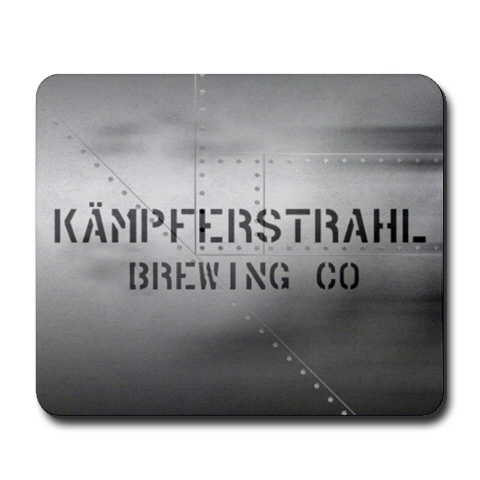
Here's the mousepad design I came up with for Cafe Press:

4688-mousepad.jpg

Just an idea but place the Kampferstrahl Brewing Co. inside a rounded suquare in red, like a stamp over the steel at an angle...

Still Pretty sweet though
 
Bump...just noticed that NO ONE has bought any Kämpferstrahl swag. Now, I'm not looking to make any profit here (markup is pretty close to the minimum that Cafe Press allows), but I thought I might get some interest. What's the detractor? Criticism welcome!
 
I'm going to do a second set of mugs this quarter.
Yours, any of the billpa designed ones that I missed and some others for maybe a total of 4-5.
 
cowgo said:
Well, 18 bucks for a white T-shirt.....I'm just saying.
I just double checked...I can't mark that one down any lower.

Just wondering if there's anything preventing anyone from buying Kämpferstrahl gear.
 
Yuri_Rage said:
I just double checked...I can't mark that one down any lower.

Just wondering if there's anything preventing anyone from buying Kämpferstrahl gear.
I've been meaning to. I'm lame. I have some x-mas money I'm going to blow here real soon. I'm definitely getting some shirts and a coaster.
 

Latest posts

Back
Top