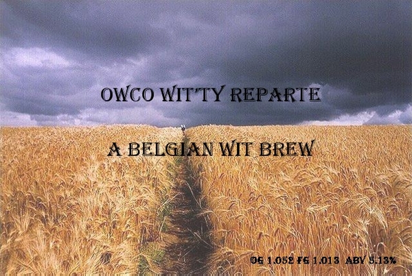
You know, I ran a search for wheat field in google images and this is one of the ones it gave me. Honestly, I couldn't tell you the difference from looking at wheat or barley. Is that barley or wheat?
You know, I ran a search for wheat field in google images and this is one of the ones it gave me. Honestly, I couldn't tell you the difference from looking at wheat or barley. Is that barley or wheat?
Barley heads lay over and point downward. Wheat heads stay pointing straight up. I think it is a sign that beer is evil {insert Dr. Evil snicker} and bread is good. Your pic is of a beautiful barley field. It doesnt matter. Wit beers are likely 50% barley anyways. Great label, but I agree that it might look even better with bigger words.
bigger words, and maybe if the first line was white (or light tan, to match the lightest color in the barley field) to contrast with the dark sky. that would only look good if the font was quite a bit bigger though.
barley is a larger head and as said before once cured hangs down while wheat will stand up. Also barley has more wiskas. Nice picture i think you could probably make a better label of it yet.

 Your pic is of a beautiful barley field. It doesnt matter. Wit beers are likely 50% barley anyways. Great label, but I agree that it might look even better with bigger words.