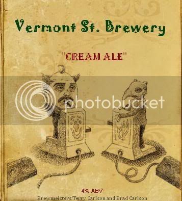
RedIrocZ-28 Supporting Member HBT Supporter Joined Oct 22, 2008 Messages 850 Reaction score 31 Location Grand Rapids, MI Nov 4, 2008 #1 Here it is. In the theme of my last one. I think this one is just as good. Simple, with some neat graphics.
Here it is. In the theme of my last one. I think this one is just as good. Simple, with some neat graphics.
Grinder12000 Well-Known Member Joined Jul 1, 2008 Messages 2,996 Reaction score 50 Location Columbus WI Nov 5, 2008 #2 I like it a lot. Tip - you can get 4 or 6 on a page in WORD. Convert it to a PDF and take it to a printer. do NOT use Landscape as the fibers run the wrong way in the paper. Use Milk to attach the label to the bottle. One tip IF you do that. Move the bottom lettering off the edge more.
I like it a lot. Tip - you can get 4 or 6 on a page in WORD. Convert it to a PDF and take it to a printer. do NOT use Landscape as the fibers run the wrong way in the paper. Use Milk to attach the label to the bottle. One tip IF you do that. Move the bottom lettering off the edge more.
C C.O. Member Joined Jul 8, 2007 Messages 12 Reaction score 0 Location Silver Spring, MD Nov 8, 2008 #3 I like it. The antique book feel is really cool. I would remove the quotation marks from cream ale though, and maybe move it up a little closer to the Vermont St Brewery text.
I like it. The antique book feel is really cool. I would remove the quotation marks from cream ale though, and maybe move it up a little closer to the Vermont St Brewery text.