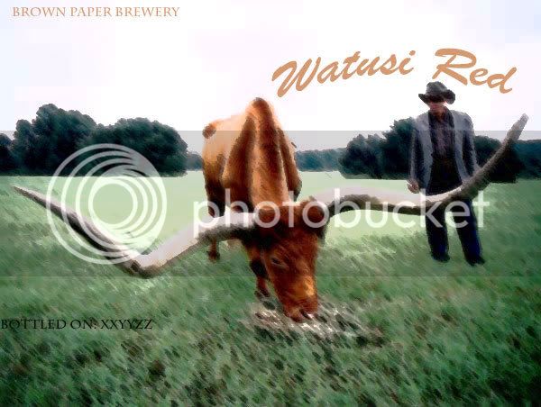
Alamo_Beer Well-Known Member Joined Aug 8, 2006 Messages 2,436 Reaction score 16 Location Manor, Tx Jun 2, 2007 #1 I saw a thing on TV about watusi's and thought they were cool...thought the name was cooler. So, this is what it inspired. Haven't brewed it yet but it'll happen.
I saw a thing on TV about watusi's and thought they were cool...thought the name was cooler. So, this is what it inspired. Haven't brewed it yet but it'll happen.
C Criniit Active Member Joined Feb 25, 2007 Messages 29 Reaction score 0 Jun 3, 2007 #2 Looks great man
Cap'n Jewbeard Well-Known Member Joined Apr 24, 2006 Messages 925 Reaction score 8 Location Baltimore Jun 3, 2007 #3 Did you apply a filter to the photo, or was it like that? I might like to do an effect like that in the future... Nice job!
Did you apply a filter to the photo, or was it like that? I might like to do an effect like that in the future... Nice job!
Orfy For the love of beer! HBT Supporter Joined Sep 27, 2005 Messages 11,732 Reaction score 123 Location Cheshire, England Jun 4, 2007 #4 I get a similar effect by applying a water colour filter in PSP.
Denny's Evil Concoctions Grande Megalomaniac HBT Supporter Joined Oct 20, 2005 Messages 7,732 Reaction score 76 Location Nanaimo, BC Jun 4, 2007 #5 I'd put the "brown paper brewery" on the lower right side. Watusi somewhat centered above the bull. The brew date on lower left side in white or grey. otherwise looks ncie.
I'd put the "brown paper brewery" on the lower right side. Watusi somewhat centered above the bull. The brew date on lower left side in white or grey. otherwise looks ncie.
OP OP Alamo_Beer Well-Known Member Joined Aug 8, 2006 Messages 2,436 Reaction score 16 Location Manor, Tx Jun 4, 2007 #6 I used photoshop and just played around with the filters till I found one I like... Yeah I might play around with the placement still but I really like this photo and label
I used photoshop and just played around with the filters till I found one I like... Yeah I might play around with the placement still but I really like this photo and label
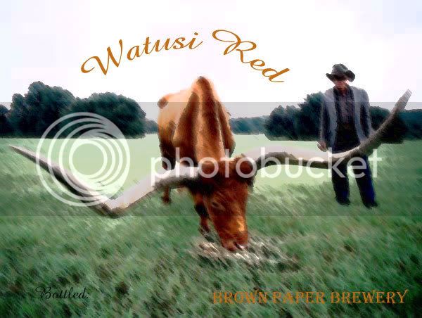
OP OP Alamo_Beer Well-Known Member Joined Aug 8, 2006 Messages 2,436 Reaction score 16 Location Manor, Tx Jul 2, 2007 #7 Well it's been a bit but I played around with it.... better?
J jarrid Well-Known Member Joined Apr 2, 2007 Messages 95 Reaction score 0 Jul 2, 2007 #8 yes! i like that font and the placement of the name a lot better. it plays off of the interesting shape of the bull's head/horns.
yes! i like that font and the placement of the name a lot better. it plays off of the interesting shape of the bull's head/horns.
Orfy For the love of beer! HBT Supporter Joined Sep 27, 2005 Messages 11,732 Reaction score 123 Location Cheshire, England Jul 2, 2007 #9 Looks better. I'd try and add more contrast to the brewery name.