You are using an out of date browser. It may not display this or other websites correctly.
You should upgrade or use an alternative browser.
You should upgrade or use an alternative browser.
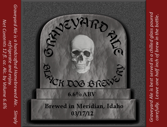
My first label
- Thread starter shootin68
- Start date

Help Support Homebrew Talk - Beer, Wine, Mead, & Cider Brewing Discussion Forum:
This site may earn a commission from merchant affiliate
links, including eBay, Amazon, and others.
Wolfhound180
Well-Known Member
Looks cool. Maybe add what style it is.
travisnd
Well-Known Member
Very cool!
Noontime
Well-Known Member
The text seems a bit dark against such a dark background...doing something to make the text "pop" might help. Maybe the engraved look (if it puts a white highlight on the interior) will help with that as well.
wells11
Well-Known Member
Very nice.
sirpilsofd
Member
Good job
The text seems a bit dark against such a dark background...doing something to make the text "pop" might help. Maybe the engraved look (if it puts a white highlight on the interior) will help with that as well.
Maybe some sort of chiseled effect then it would be:rockin:
Maybe some sort of chiseled effect then it would be:rockin:
Fastest way would probably be to use an "emboss" effect on the tombstone. FWIW I agree that would make the label over the top.
Noontime
Well-Known Member
I do think its great by the way. Something that struck me is it's a little mono-chromatic in the center and then there's the color on the sides. Maybe kill two birds by lightening the color on the sides a little and using some of that same color with the text (emboss, shadow, etc). Just some ideas.

Thoughts, critiques anything you can add. First attempt.
...It also needs a boney set of fingers or a skeletal hand coming out of the ground or from around the back of the toomstone like it's coming for you...Because you know it will be calling from the depths of the BMP (enter ghostly voice here) "Driiink Meee" once it's bottled
Just a thought but it looks great as is...
bionicbrew
Well-Known Member
I actually like the font, but would keep it consistent on the grave stone. i.e.-ABV and Brewed in...
From minoring in graphic design in college, i can tell you that it is best to use a font that is easy to read at first glance yet pleasing to the eye; not something that you really have to decipher and learn each letter before understanding what it says.
im not trying to be a jerk here mind you, just some constructive criticism
im not trying to be a jerk here mind you, just some constructive criticism
Similar threads
- Replies
- 27
- Views
- 1K
- Replies
- 1
- Views
- 392


